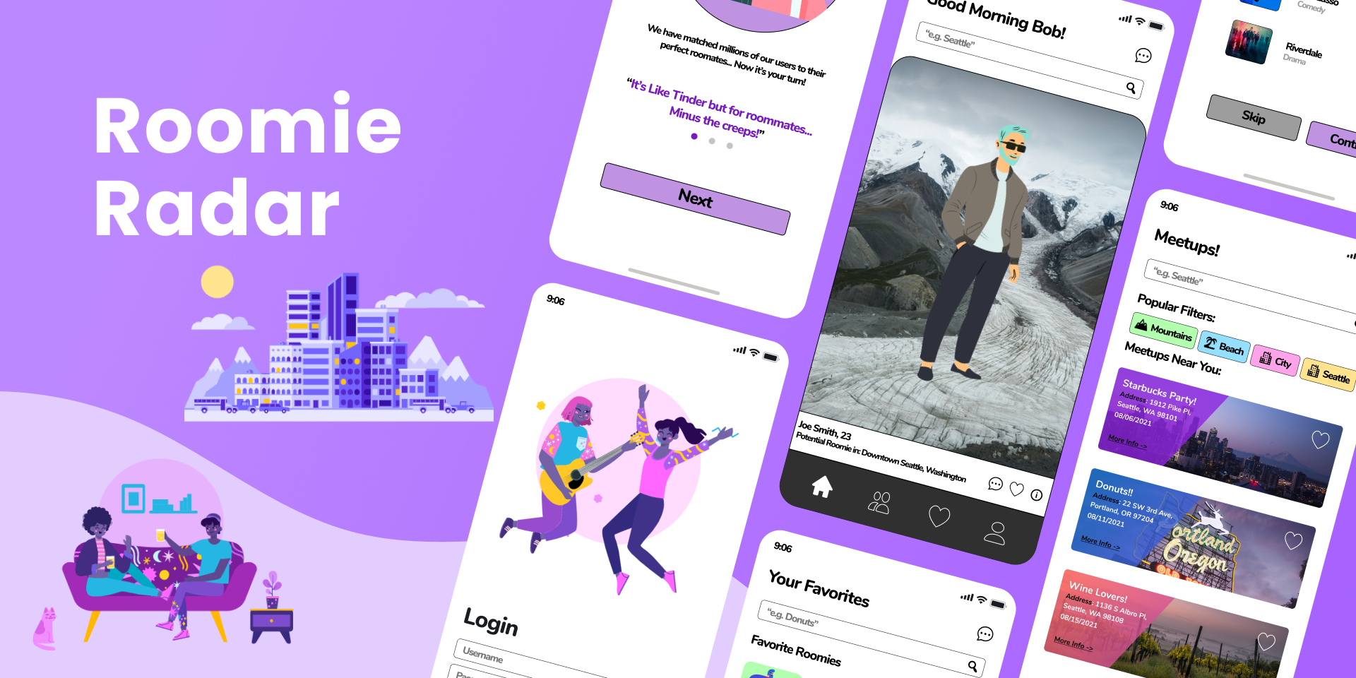
Roomie Radar
Match with your next roommate!
In tackling a daunting scenario that many movers encounter – relocating to an unfamiliar area and living alone – I conducted insightful interviews with soon-to-be college graduates. Through this design challenge, I aimed to develop a mobile application that not only alleviates their fear of solo living but also offers a user-friendly platform to connect with new people.
Product 📱
Roomie Radar is a roommate matching/finding app where users can match with others in order to find their ideal roommate. The app also offers a feature where you can reserve meetup spots so that you can gain more friends in an area which you are unfamiliar with.
Problem 🤔
Frequently, people who have just recently gotten hired or graduated college are likely to relocate according to their new jobs location. Relocating can be a scary concept for most people as it means that you potentially could be moving to an area where you don’t know anyone.
Goal 🎯
In order for people to move to an unfamiliar area comfortably, the goal of this product is to provide assistance for those who are planning on moving. Whether it’s finding a roommate so you don’t have to live alone or simply offering meetups where people can meet with other new faces.
Role 🙋♂️
Visual Designer & UX Researcher
Responsibilities 📋
User Interviews, Paper Prototyping, User Surveys, UX Research, lo-fi/hi-fi Prototyping , Visual Design, Usability Testing.
Duration 📅
August 2021 - November 2021 (3 Months)
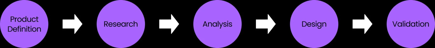
Overall Process
User Research: Summary
One primary user group which we were able to identify through user interviews/surveys were recent college graduates who had found a job and needed to find a roommate in the area which they are relocating to. The other primary group that was identified were other age groups that are forced to move to a new job which they had accepted.
User Research: Pain Points
Usability: Some people have a hard time using a mobile device let alone any mobile application.
Matchmaking: Some people have tried out other roommate searching apps but were not satisfied with its matchmaking.
Commitment: The app offers a “one-time” use and never come back aspect.
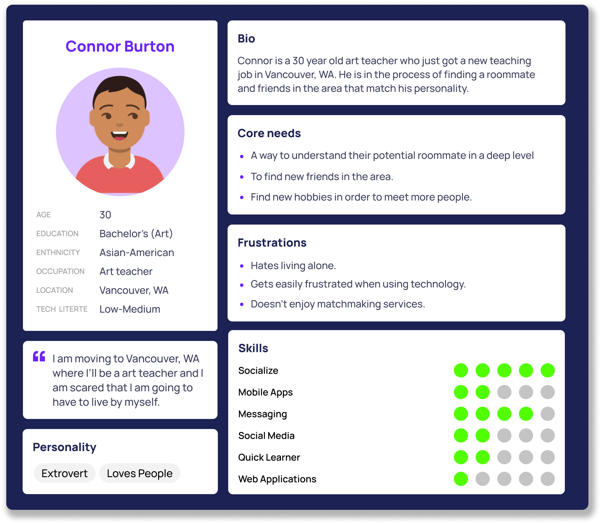
User Personas
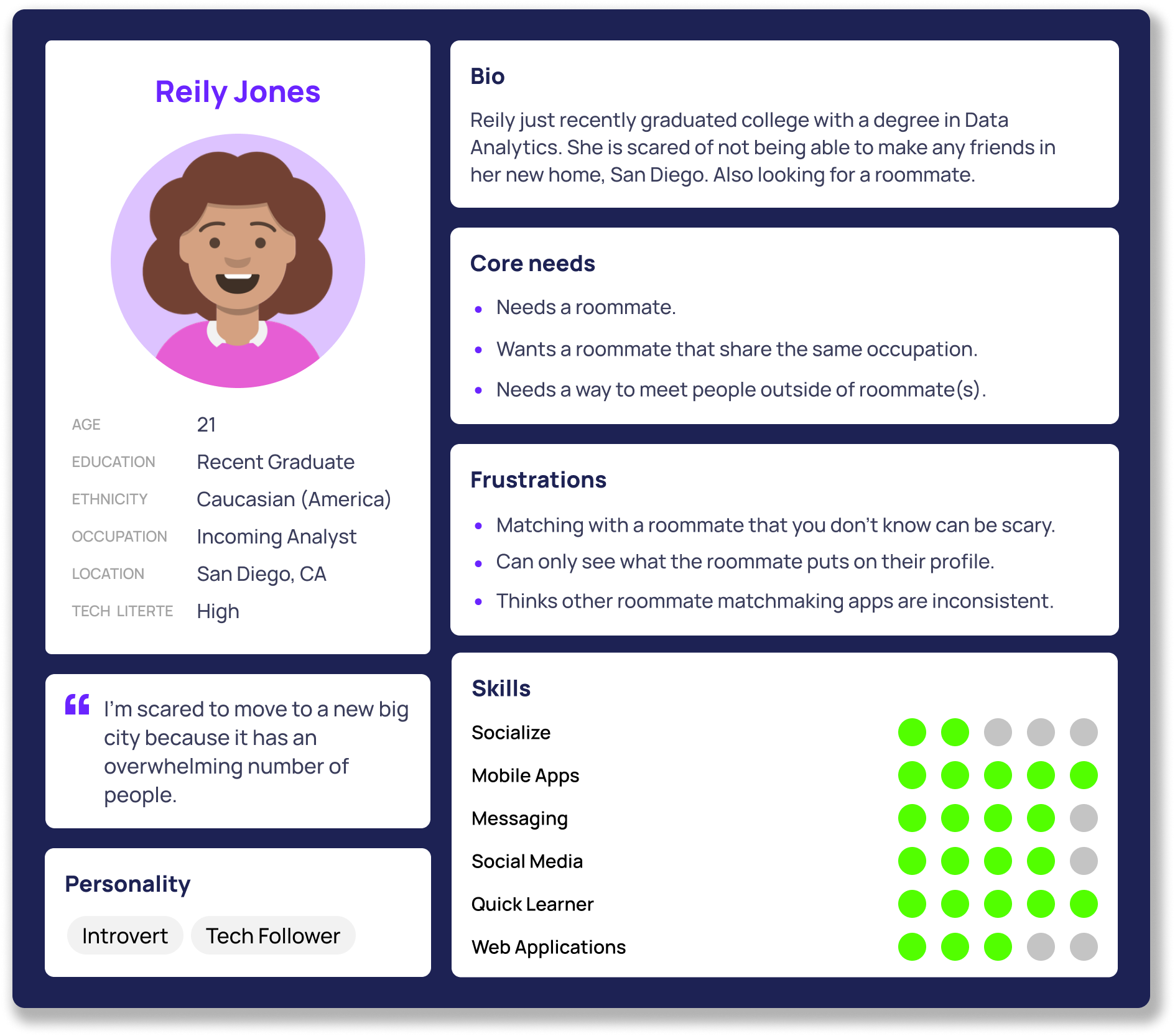
Reily is a recent college graduate who is about to relocate for a job that she just accepted. She wants a roommate that meets her preferences but is scared to meet new people. Through Roomie Radar, she is hoping to find someone who she wants to be roommates with and also make some new friends.
Connor is a hardworking art teacher who is extremely extraverted but has trouble with using technological devices. He is scared of living alone and wants to find a roommate quickly through the app. He has had bad experiences with other matchmaking services in the past and is hoping that this one gets it right.
User Journey Map
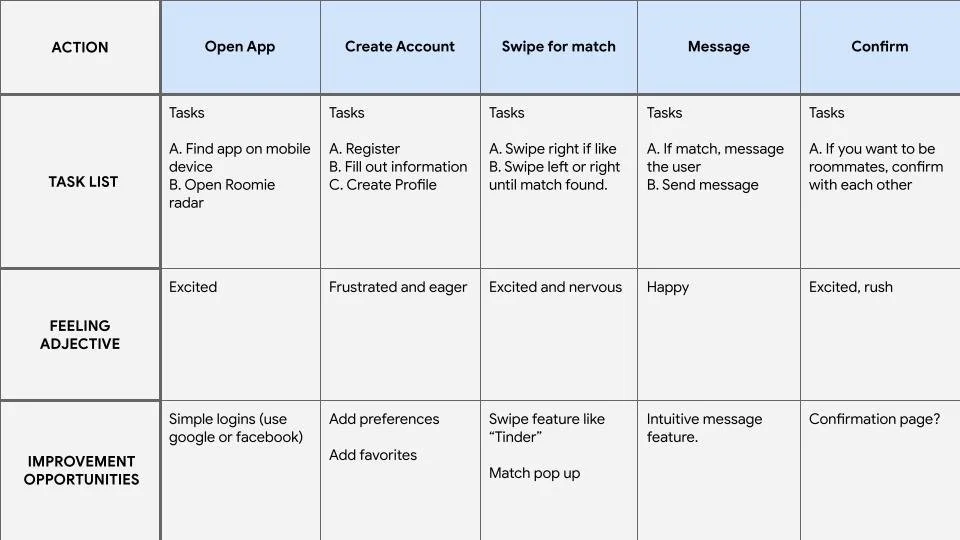
Persona: Reily Jones
Goal: Match with another user on Roomie Radar.
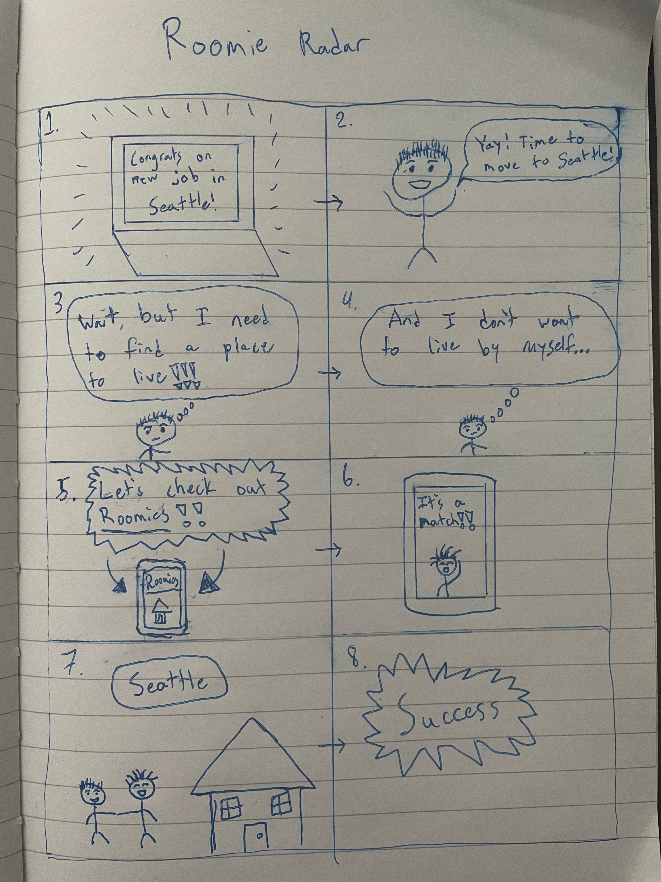
Storyboards: Big Picture
Now that I had a better understanding of what the most significant goals were, I had to create a visual representation of how the potential product would be used to solve these goals.
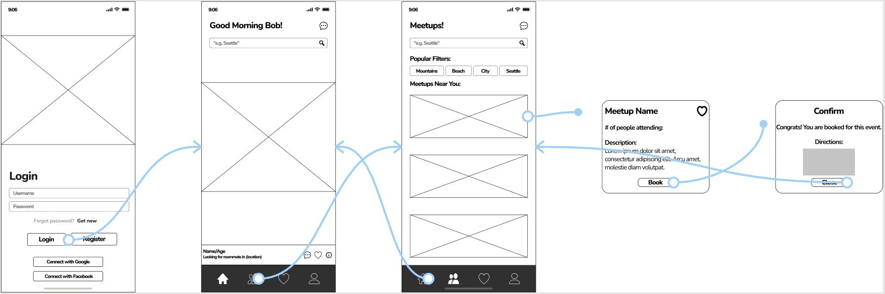
Digital Wireframes
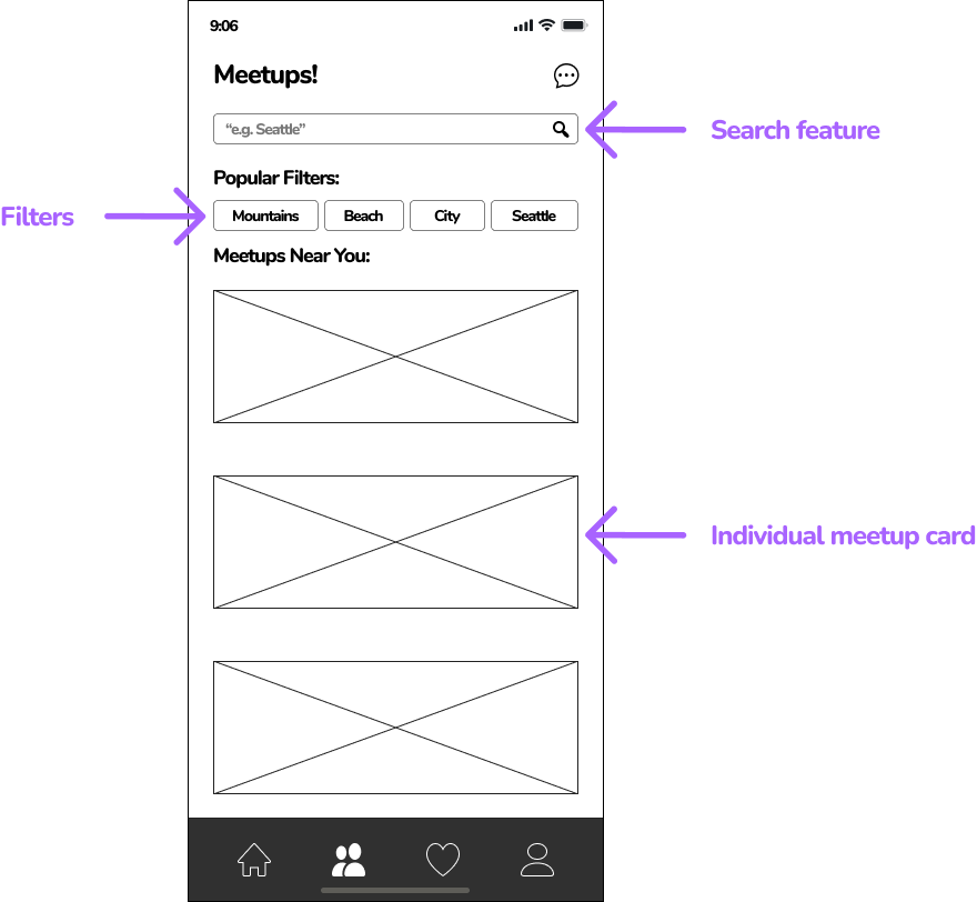
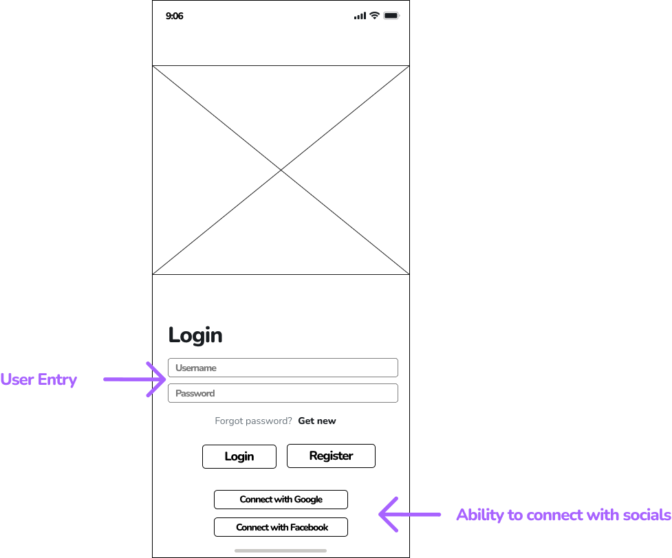
Lo-fi Prototype
Down below is one of the interaction flows that links the digital wireframes. In this instance, the flow shows how a user can login and book a meetup w/ confirmation.
Usability Study: Parameters
Study Type: Unmoderated usability study
Location: Walla Walla, WA | Remote
Participants: 7 participants, age 18 - 35
Length: 20 mins
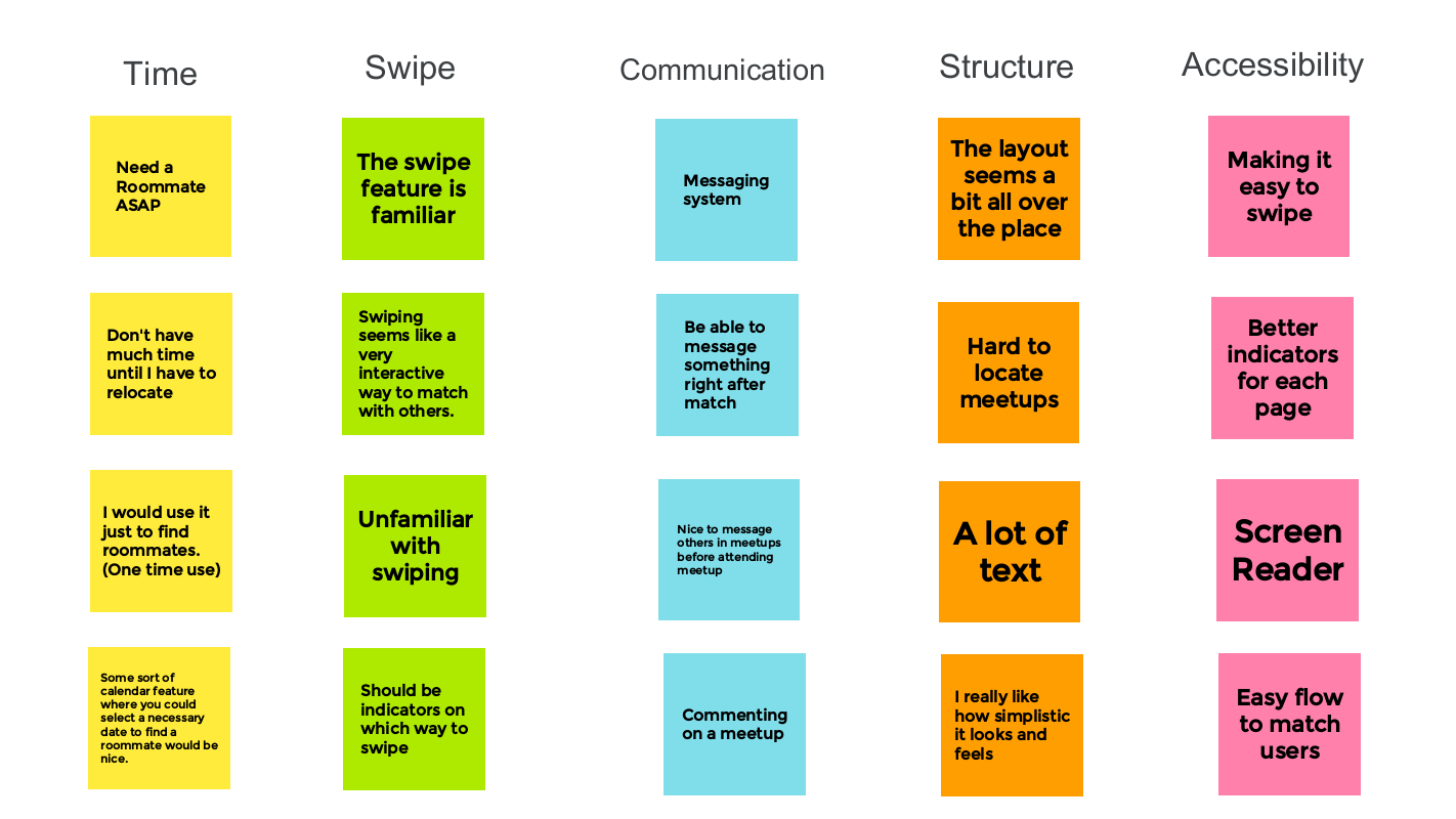
Time: One of the key factors that plays into this app design is that users might not feel the need to come back after matching with a roommate.
Structure: Overall, the layout of the app was something that users enjoyed but they also noted that there was a lot of text involved as well as a lot of features that didn’t have significant noticeable indicators.
Swipe: The swipe feature seems to be a hit with all of the users from the study but they also stated that it could be hard for users that are unfamiliar with a swiping system to be able to use it effectively.
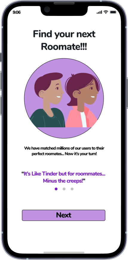
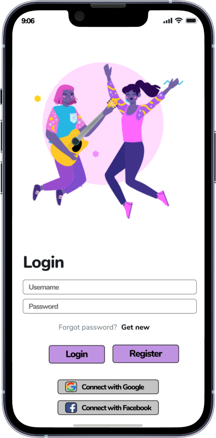
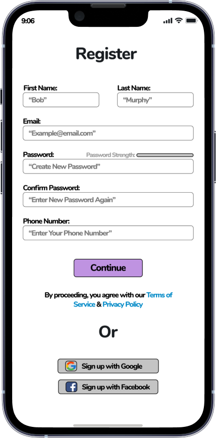
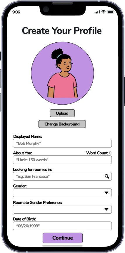
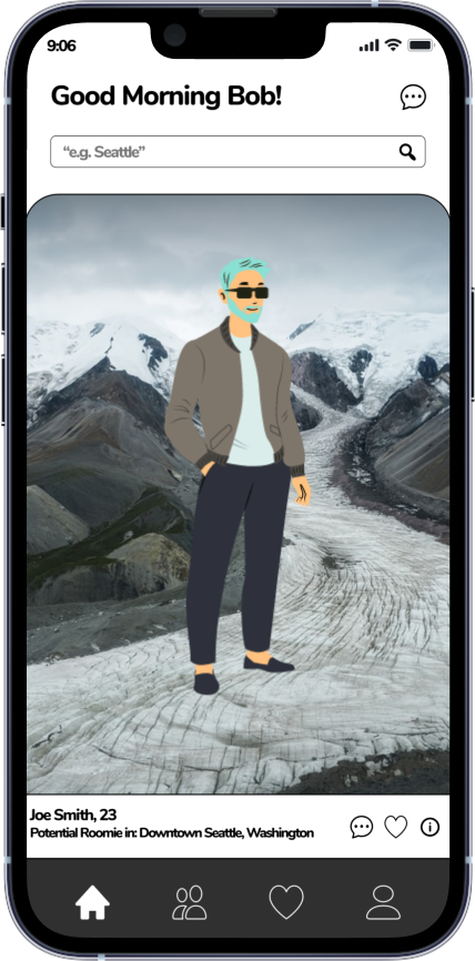
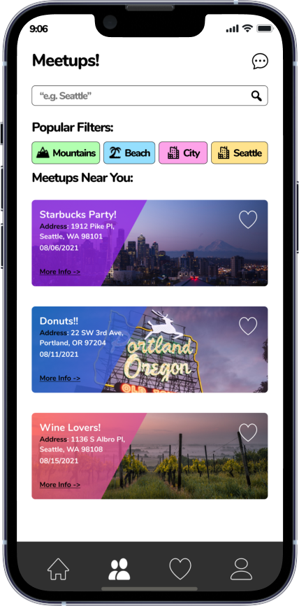
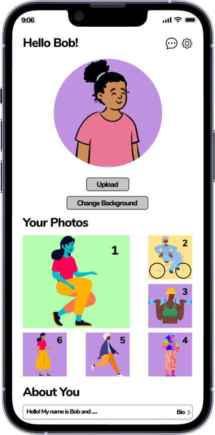
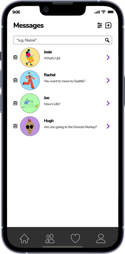
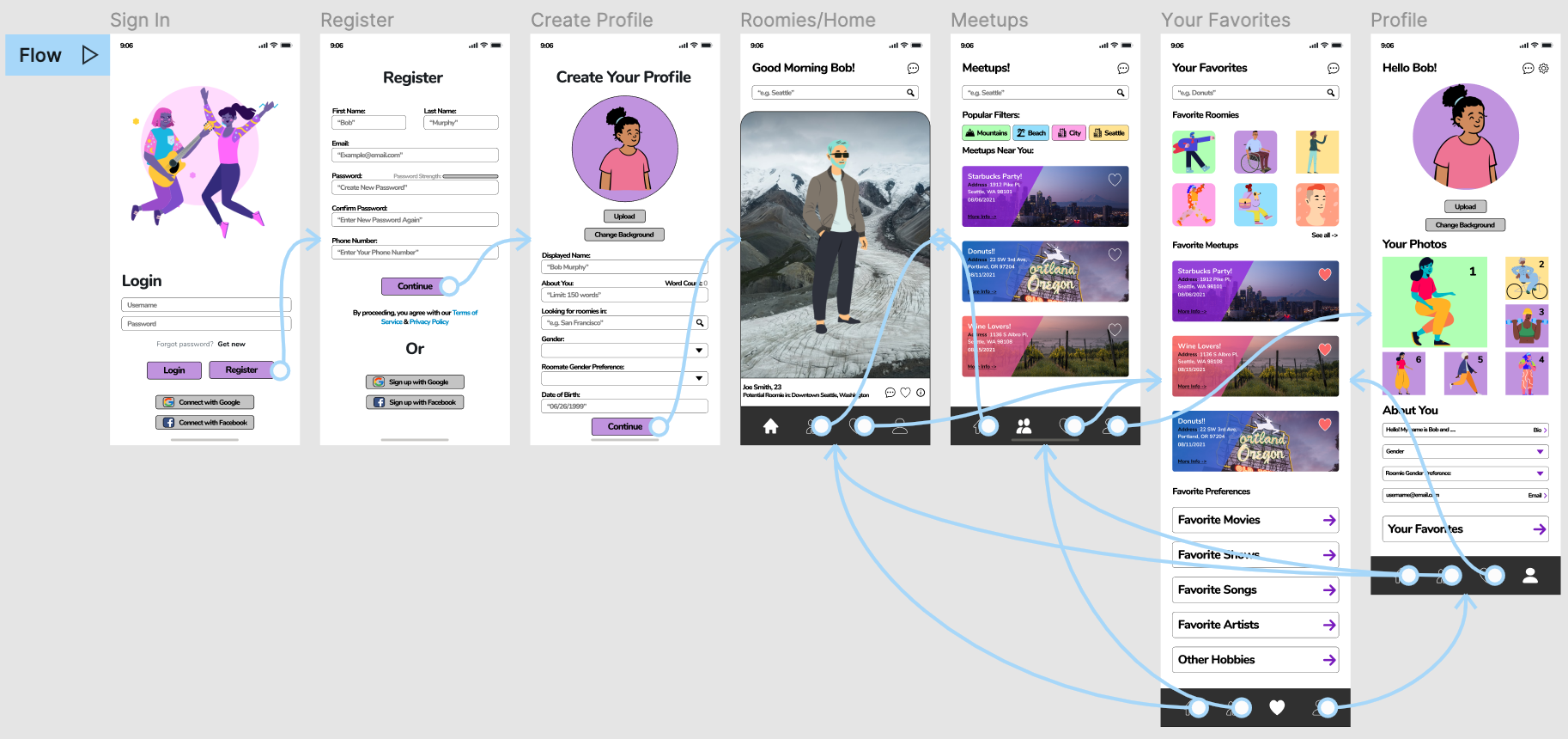
Hi-fi Prototype
And here we have it, the final prototype. With the critical feedback that I had gained within the previous testing phase, I was able to add visual features as well as additional pages that deemed necessary for the user to achieve their end-goals. Check out some of the final mockups below!
What I Learned 🧠
One of the key takeaways from this project was understanding how to link multiple features within one single mobile app. We had created a flow for matching with other roommates, meetups/events, as well as having your own favorites page. After many different iterations of user testings, we were able to figure out how to incorporate all of these features in a way that was extremely insightful yet very intuitive to use. Making a clear distinction between each feature was something that was critical and produced many mental bumps in the road for us but those bumps only helped us gain more valuable insights in the long run! Overall, this was a very fun and collaborative project and I can’t wait to learn from this experience and create some more!